Developing a website is one thing and developing an effective on is different. Most of the business firms operating in the online domain have a website of their own, however not many have that efficiency. The simple rule of just get a website developed is no longer apt. To be effective a website needs to user-friendly.
Talking about user-friendliness the very first thing that comes to the context is the ease of access. The more easily the user is able to access your website the more chances of he being able to spend some time on your web pages and make a tap on those Call to Action (CTA) buttons.
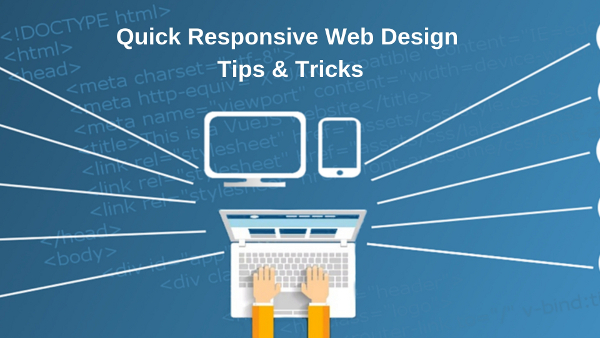
In order to ensure ease of access, the website must be quick loading and responsive in nature. By responsive we mean a website that is designed to operate across various devices, browsers and screen sizes without any problem. Developing a standard PC website would be difficult to load in a mobile or tab like devices and hence would cut it on your traffic generation sources. On the other hand, if you go for a mobile responsive website then it would not be effective for PC users as aspects like resolution would be an issue.
Thus, having a responsive website designed is the order of the day in order to ensure that you don’t miss out on traffic and user from any source. To get these quick responsive website designed firms hire dedicated web designers to lend in there service and expertise. To hire dedicated web designers to create that quick and responsive website assures delivery of quality solutions to the firms.
However, there are certain tips and techniques that you must be aware of in regards to the development of quick responsive website design. Knowing these tips and techniques would help you in directing and guiding your web designer to deliver you that effective web design.
So, if you are someone who is looking to hire a web designer or a budding web designer learning the skills of website design and development then this one is for you.
Asses the user behavior
In order to make your web design quick and responsive, the first thing that you should do is to assess the behavior of the users/visitors on your website. Try to capture the trends and patterns of the user’s movement on your website when they access your web pages from different devices.
Assessing this would give you insight into information like:
- Which web page is accessed most by users say, the ‘About Us’ PAGE
- What’s the pattern of navigation of users from different devices
- From where (which device) is the maximum traffic getting driven
This information would be quite effective in order to enhance the responsiveness of the most accessed web pages and thus the overall responsiveness of the website.
Image connect
Images and audiovisual content on your web pages create an instant connect with the users. It is natural for the human mind to get attracted towards the pictorial and representative theme, and the very fact helps you in making your website responsive the right way.
Optimize the images on your website, without altering the quality so, that they can easily get uploaded on various devices (from which the website is accessed). Refrain from adding too much of images as this add to the HTTP request generation pulling down the website loading efficiency.
Mobile First
The first steps in order to make your website responsive shall be directed in the context of mobile users. Now, this has some substantiative reasons behind it. We all know by now that mobile users are driving over 80% off the traffic on websites.
The spread of smartphone-based mobile telephony coupled with lightning fast internet speed has provided users with an on the go access to the things they want to see online. So, make sure that you ensure user-friendliness for the source that is generating the bulk of the traffic. To capture the remaining you have all the time in the world.
Pay Attention to CTAs
Now, this can be the most important point while working on the responsiveness of your website. Do make sure that your Call to Action (CTA) buttons are not been neglected as the website loads on the various device.
By neglected we mean that whether the CTAs are clear and defined on your web pages when the website is accessed through a mobile, tablet, PC and laptop or are seen reduced or sidelined in small screens (like mobile). To avoid that neglect of CTAs use the proper color theme for them that attract users eye and be careful in regards to their positioning.
The CTA shall be placed in an area with maximum user navigation and should be the lone attention gainer with surrounding elements (say graphics) supporting the diversion of attention towards CTA.
That’ all folks, we hope that you have noted these tips and techniques and would bring them to practice to make your websites quick and responsive. If you think we missed on something then feel free to comment below.


